I put together these samples to demonstrate Vietnamese typography. My goal is to help designers see how Vietnamese typographic elements work together as a whole even without knowing the language. The more I designed these samples, the more pleasure I got out of them. They have become my personal collection of Vietnamese culture and literature. I continue to create more samples when time permits. I hope you enjoy browsing them as much I enjoy crafting them.
Samples
Bảo Ninh
Bảo Ninh is known for his historical fiction on the Việt Nam War. His works have been translated into 20 languages, including English. After reading his compelling short stories, I decided to create a typographic sample page featuring “Hà Nội at Midnight” and “Untamed Winds.” These two stories provide a glimpse into Bảo Ninh’s observations of the war. I also included English translations from Quân Mạnh Hà and Cab Trần. The sample is typeset in Atlante, designed by Yorlmar Campos & Martín Sesto.
những tin tức về một ngôi làng
Nguyễn Thanh Hiện’s những tin tức về một ngôi làng (chronicles of a village) is a historical fiction based on a nameless village and told through a nameless scribe. The entire novel is written in lowercase letters and without any periods to give an oral tradition of storytelling. The series of story are fragmented mixing mythology with history. I selected a few chapters to introduce this fascinating work of literary. I included Nguyễn Thanh Hiện’s original Vietnamese text as well as Quyên Nguyễn-Hoàng’s outstanding English translation. The sample is typeset in Newsreader, designed by Hugues Gentile and Jean-Baptiste Levée.
Giữa người với người
Nguyễn Ngọc Tư is a littérateur of short stories who has a distinctive style of capturing the language of Southern Vietnamese, particularly in the Mekong Delta. Her stories are often heavy on social issues and injustices. After reading Đong tấm lòng, I decided to pull a few of my personal favorite stories to put together a Vietnamese typographic sample. For the main text, I chose Hahmlet, designed by Minjoo Ham and Mark Frömberg. For the title cover, I chose Smooch, designed by Robert Leuschke. Special thanks to Nhựt Trường for his request to create this sample and his recommendation of her book.
Strength: Nghị lực
In 2011, I had the opportunity to work with Activist and Author Jennifer Karin on her websites and print materials. In late December of 2011, Ms. Karin sent me her “Strength” card to redesign. I loved her prose; therefore, I asked her if I could put together a digital version that could be hosted on my site. She generously granted me permission. In the last few days of 2025, I decided to revive the “Strength” page. In addition, I would like to translate Ms. Karin’s words into Vietnamese. I redesigned the page and typeset in Lang and Lang Gothic, designed by Stephen Nixon.
Vé đi tuổi thơ
Nguyễn Nhật Ánh is a prolific Vietnamese writer who has been known for his young adult novels. Cho tôi xin một vé đi tuổi thơ, his acclaimed novella, has been translated into English, Ticket to Childhood, by William Naythons. To give a sample of the book, I selected three chapters and set them in Vollkorn, designed by Friedrich Althausen, and Kuhlman, designed by David Jonathan Ross. Although Kuhlman is a work-in-progress typeface, its rough edges work great for the cover title. Vollkorn was one of the early open-source typefaces that supported Vietnamese. I have been wanted to showcase Vollkorn for a long time. I finally got a chance to use this beautiful, readable text face for this project.

Những bài không tên
The name Vũ Thành An is synonymous with “Những bài không tên,” a series of untitled Vietnamese love songs. Because these songs were written about his past lovers, the famed Vietnamese musician and composer didn’t want to reveal their names. The first ten songs in the series had been covered countless of times by several generations of Vietnamese singers. The rest hadn’t been recorded much; therefore, I would like to put together a collection so the pieces can be read as poems. Even though the series has 112 songs, many of them are missing. I collected as many of them as I could find. For typesetting, I selected NaN Druid and Nan Druid Sans, designed by Anna Khorash and Reymund Schröder.
Oh, the Places You’ll Go
I had always wanted to translate Dr. Seuss’s Oh, the Places You’ll Go into Vietnamese, but I hadn’t found the time. Fortunately, Nhã Thuyên beat me to it and she had done the justice in capturing Dr. Seuss’s uplifting prose. In this typographic sample, I wanted to showcase both languages side by side. I also keep the color scheme from the book. Since the focus is on typography, I left off the illustrations. The sample page is typeset in NaN Success, designed by Jérémy Landes, and NaN Serf, designed by Daria Cohen, Fadhl Haqq, Léon Hugues, Jean-Baptiste Morizot, Luke Prowse, and Florian Runge. Now you can enjoy Dr. Seuss’s classic in Vietnamese as well.
Right & Wrong & Being Strong
The moral guides in Lisa 0. Engelhardt’s Right and Wrong and Being Strong are applicable not only for kids, but also for adults. I had learned a thing or two from this Elf-help book. Since Minh Hiền has done an exceptional job of translating the original text into Vietnamese, I decided to create a typographic sample page to showcase both languages. For typesetting, I settled on Thow, designed by Dương Trần, a young and rising type designer living in Hà Nội, Việt Nam.
Ru
Quốc Bảo’s 9 Bài Ru is a series of nine songs titled “Ru” (Lull). On the record, the melodies are melancholy and the lyrics are alluring. On the page, Quốc Bảo’s words become poetry. Through minimal arrangements, Nguyên Hà, Phạm Hoài Nam, and June Nguyễn had done an excellent job of telling his stories with their captivating vocals. Through typography, however, readers get the direct experience from his words. They don’t have to follow the singers. They can read at their own pace and draw their own stories through the rain, the storm, and the lover. For the lyrics, I chose Jean-Baptiste Morizo’s NaN Tragedy, specifically the italic type because it sings. For display text, I settled on Robert Leuschke’s Love Light for its swelling cursiveness.
Món ngon đi từ ký ức
I read Nguyễn Duy Quyền’s Quên Được Cứ Quên, a collection of 80 short essays, eight years ago. I enjoyed his personal recollection of his mother’s and grandmothers’ countryside cooking. His prose took me right back to Việt Nam. I could hear the sizzling sound of bánh xèo (Vietnamese pancake), taste the fresh herbs and vegetables, and breathe in the fragrance of the mixed fish sauce. After rereading this book, I decided to create a sample Vietnamese typographic page featuring six essays on “delicious dishes from childhood memories (món ngon đi từ ký ức).” For typography, I chose David Jonathan Ross’s Pennyroyal DJR for reading text and Robert Leuschke’s Caramel for display text.
Thang Máy Sài Gòn
Thang Máy Sài Gòn is an investigative fiction written in Vietnamese by Thuận and translated into English by Nguyễn An Lý—Elevator in Sài Gòn. I enjoyed reading it so much that I wanted to create a sample page with both the original Vietnamese version and the English translation. I selected the juiciest chapter, in which the translator went beyond the detail from the original text. The sample page is typeset in Nan Rage superfamily, designed by Hugues Gentile, Fanny Hamelin, Fadhl Haqq, Léon Hugues, Jean-Baptiste Morizot, Luke Prowse, Florian Runge, Jolana Sýkorová.
Idioms: Thành ngữ
This sample features a collection of English idioms translated into Vietnamese. I selected these idioms from Tiếng Anh Tèo and Người Việt Mình Nói. The page is typeset in Cosima and Kukka, designed by Anita Jürgeleit.
Dire Critical
In 36 Ways of Writing a Vietnamese Poem, Nam Lê wrote a piece on Vietnamese diacritics titled “Dire Critical.” With lyrical prose, Lê explained the importance of tones. For example, ma has a completely different meaning depending on the accompanying diacritical mark (má, mà, mạ, mã, or mả). Since “Dire Critical” has some useful information, I decided to create a sample page to illustrate Vietnamese typography. Through HTML markups and CSS presentations, I designed the web page to resemble the printed page. The poem is typeset in Bono Nova, designed by Mateusz Machalski and Andrzej Heidrich.
Love Letter #3
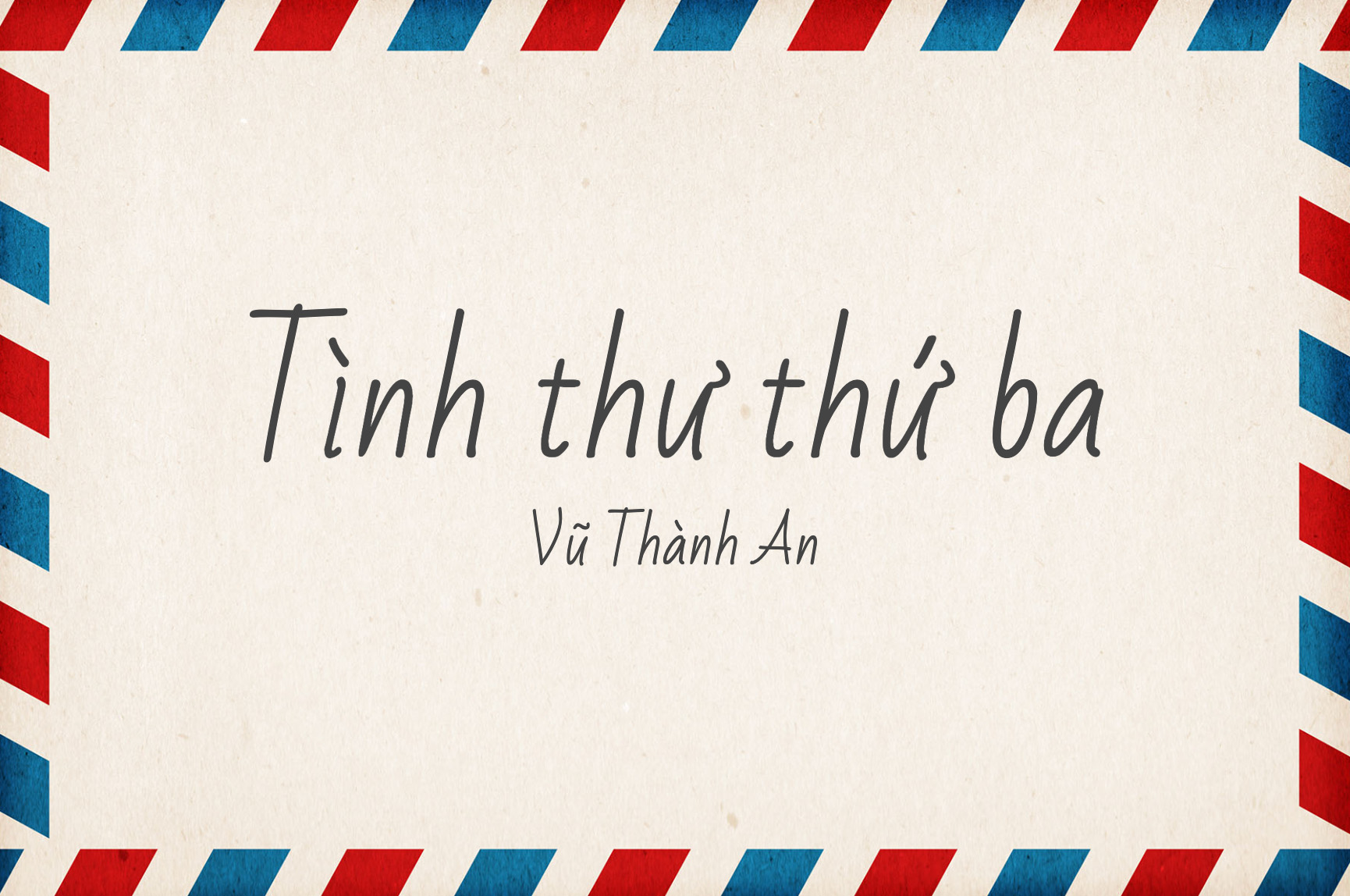
Vũ Thành An is a talented Vietnamese songwriter who is well-known for his series of untitled love songs. In 1997, he published his first book, Chuyện tình không tên (Nameless Love Stories), in which he shared personal accounts behind his nameless songs through written letters. As a kid, I always marveled at the beauty of handwritten letters. In Vietnamese culture, writing with a fountain pen is an essential skill. To showcase a handwriting typeface that supports Vietnamese, I selected Vũ Thành An’s “Tình thư thứ ba” (Love Letter #3) from his book. After playing around with a handful of cursive typefaces, I settled on Bad Script, designed by Gaslight, for its handwriting quality.
badòngthơ
Physician-poet Cao Nguyên, the author of Thơ Mưa (rain poems), follows up with badòngthơ (tercets). The form for badòngthơ is similar to the Japanese haiku, but Cao Nguyên also plays with three, five, and seven syllables. When he asked me to bring badòngthơ to the web, I jumped at the opportunity. The book title is set in SVN Conqueror Didot, a Vietnamese-supported version of AW Conqueror, designed by Jean François Porchez. The main text is set in Inclusive Sans, designed by Olivia King. The entire book, which features 119 poems, is available on the website. If you can read Vietnamese or want to learn Vietnamese, you will enjoy the delightful poems in badòngthơ.
Làm Đĩ
Làm Đĩ is a novel about prostitution written by Vũ Trọng Phụng. Although it was published in 1936, the book is still a refreshing read. Vũ Trọng Phụng was such a great writer who was ahead of his time. Even though I only read it in recent months, I loved the book so much that I decided to create a sample page to preserve it. The book is typeset in Job Clarendon, by Bethany Heck and David Jonathan Ross.
Đinh Cường
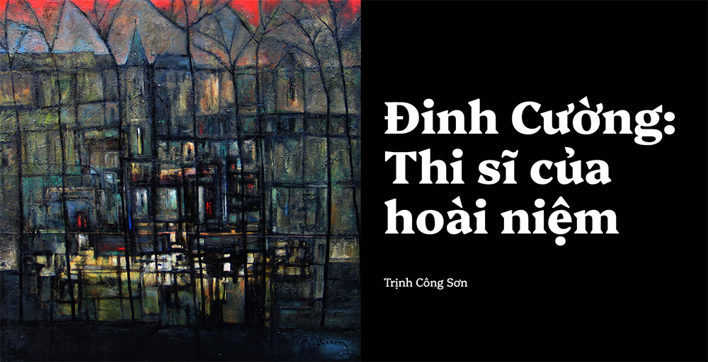
After reading what Trịnh Công Sơn had to say about his artist friend, I decided to put together a tribute page for Đinh Cường, whose website I designed more than a decade ago. I also would like to present some of his oil-on-canvas masterpieces. I created an art-direction sample with the integration of typography and imagery. For typesetting, I chose Platypi, designed by David Sargent, for its quirky features such as the contrast between sharp and heavy serifs and intriguing visual rhythms.
Bonjour Vietnam
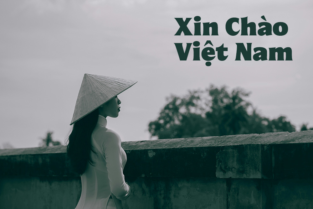
On February 4, 2006, I launched a slideshow based on “Bonjour Vietnam,” a French song recorded by Phạm Quỳnh Anh. With gorgeous photography of Vietnam accompanying beautiful melody, the slideshow went viral around the world. Now, 18 years later, I revisit the project and put together a sample page. The main text is set in Herbik, designed by Daniel Veneklaas, and display text is set in Lavishe, designed by Dương Trần.
Lời nhắn (Messages)
In her book titled Mỗi ngày gửi cậu một cái ôm (Each Day I Send You a Hug), Là Trang shares 108 positive, thoughtful messages to the youths to help them navigate through life. Even as an adult, I find her words compelling; therefore, I quoted a few lines and added my own English translation. I created this sample page to share her positive thoughts. For typesetting, I selected Montagu Slab, designed by Florian Karsten.
Groovy Guide to Life
I was reading Pete the Cat’s Groovy Guide to Life, by Kimberly and James Dean, with my five-year-old son, who chose the book from the library, and falling in love with the quotes the author had compiled. I decided to translate the quotes into Vietnamese and created a sample page with both languages. To make it groovy, I chose vibrant colors for each quote and typeset in Calistoga, designed by Yvonne Schüttler and Eben Sorkin, combined with Neue DIN, by Hendrik Weber, Andreas Frohloff, and Olli Meier.
Lì Quá Để Nói Quài
Anh Cầm Fact’s Lì Quá Để Nói Quài is a pocket-size book filled with Vietnamese quips and wordplays. I enjoyed the prose so much that I had to create a sample page with my personal favorite quotes. The page is typeset in Bricolage Grotesque, by Mathieu Triay.
Beacon of HOV
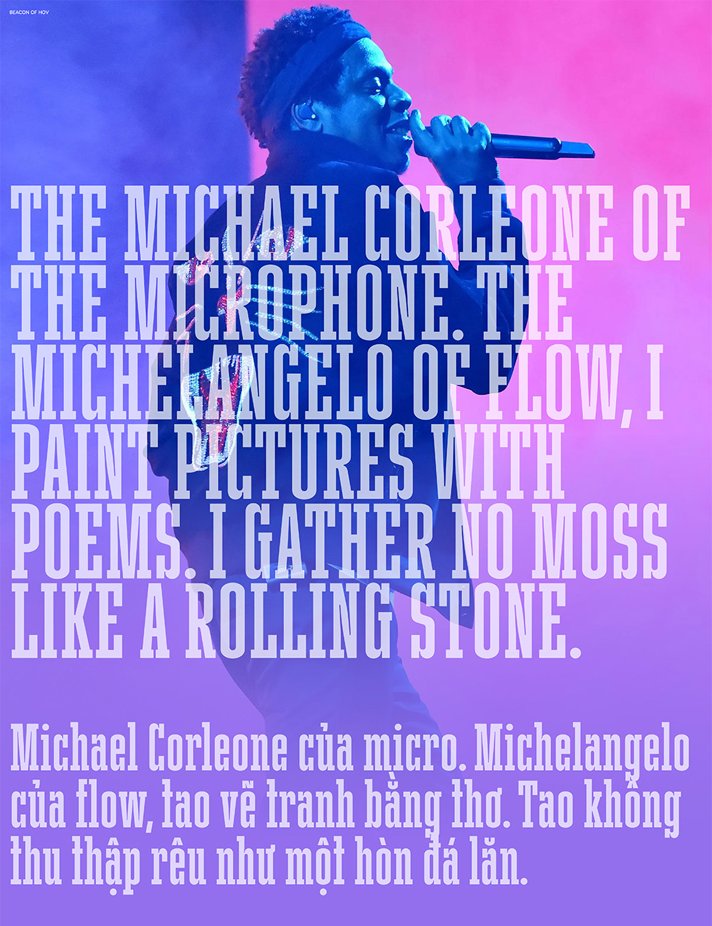
JAY-Z is a lyrical living legend. Underneath his flamboyant flows, he packed his rhymes with articulated alliterations, meticulous metaphors, and witty wordplays. When listening to his music, I always found something new and intriguing. For over a decade, I wanted to pore through his entire catalog to select rhymes that fascinated me. I kept it on the back-burner because I couldn’t find the time. Furthermore, I would have to sift through his misogynist materials as well as his extravagant lifestyles. I had no interest in either subject. The more I listened to his music, the more his words got into my head. Once I could get past his misogyny and wealth, I found his hustling mentality to change his life and his relentless audacity to change the world inspiring and motivating. In the last few weeks, I was determined to read through song by song, line by line, and word by word starting with Reasonable Doubt to 4:44 and his guest verses for other rappers. Beacon of HOV is my passion project in which I would like to shed a light on his rhymes that spoke to me. Furthermore, I would like to translate them into Vietnamese. I am not a translator; therefore, I use Google Translate to help me get started. Then I edited Google’s translations with my own understanding of his words. I enjoyed learning the art of translation. With my favorite JAY-Z rhymes and my Vietnamese translations, I needed a space to host them and the sample section for “Vietnamese Typography” fit the bill. I wanted the web page to be as simple as possible; therefore, I came up with a random system that would feature a different quote, set in a different font, and display a different background photo each time someone visited the page. For typography, I chose typefaces with condensed width so I could make the quotes bigger. I had a blast putting the page together. I invite you to refresh the page, read the quotes, and be inspired.
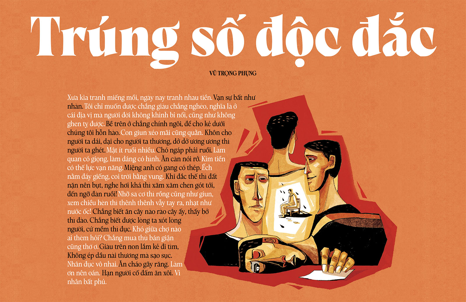
Trúng Số Độc Đắc
While reading Trúng Số Độc Đắc (Winning the Lottery), a classic novel by the great late Vũ Trọng Phụng, I encountered so many use of Vietnamese proverbs. One of my favorites is “Con giun xéo mãi cũng quằn” (Even a worm will turn). I collected them for my literary leisure and created a sample page. Typeset in Loes, designed by Dương Trần.
Cổ Tích Nhi Đồng
Reading Vietnamese children folk tales reminds me of my childhood in Việt Nam. My personal favorites included Lưu Bình-Dương Lễ and Sơn Tinh-Thủy Tinh. I was glad to see these stories translated into English. I created this sample page hoping my kids will read these folk tales to learn about their root. Typeset in Playpen Sans, designed by Laura Meseguer, Veronika Burian, and José Scaglione.
Phạm Duy
I have been obsessed with Phạm Duy’s music. The more I paid attention to his lyrics, the more I appreciated his gift for words. In addition to relistening to his songs, I wanted to take a deep dive into his lyrics. The result is a sample page featuring songs I have loved as well as songs I haven’t heard. I wanted to create a page I can read on my phone when I have a few minutes to spare. While I can visit various Vietnamese music websites to read Phạm Duy’s lyrics, I prefer an ad-free page with all the songs in one place. Furthermore, I want to have a pleasant reading experience. For the typesetting I combined Fern, designed by David Jonathan Ross, and Case, designed by Erik Spiekermann, Anja Meiners, and Ralph du Carrois. Since Phạm Duy had written over 1,000 songs, the selection for this sample is only my personal favorites. I left out political, controversial songs and epic compositions.
Là Việt
This sample contains ten selected poems from The Secret of Hoa Sen, written by Nguyễn Phan Quế Mai and translated by Bruce Weigl and the author. For the title of this project, I chose “Là Việt” because Ms. Nguyễn speaks eloquently and proudly about being Vietnamese. “We have crossed the glorious cities / Paris of light or ancient London,” she writes, “Our souls still drift back to our harbor.” For typesetting, I selected Kaius, by Lisa Fischbach, for reading text, and AT Kyrios, by Stephen Nixon, for display text. If you like this sample, pick up a copy of The Secret of Hoa Sen for the full experience.
Tình Ca Phạm Duy
In his vast repertoire, Phạm Duy had written a handful of songs about feelings. “Tình Ca” expressed his love for the Vietnamese language and people. “Tình Hoài Hương” expressed his nostalgia for his homeland. “Tình Kỹ Nữ” expressed his feeling for a prostitute. “Tình Hờ,” my personal favorite, expressed his pity for a poor lover who had no idea that she had been deceived. He even confessed: “Khi tôi tìm đến em / Là tìm vui trong chốc lát / Đến một lúc rồi quên” (When I looked for you / I only sought for a quick pleasure / I came for a moment then I forgot). In this sample, I put together 15 songs with the “tình” theme. I typeset them in Aneto, designed by Veronika Burian, José Scaglione, Azza Alameddine & Roxane Gataud.
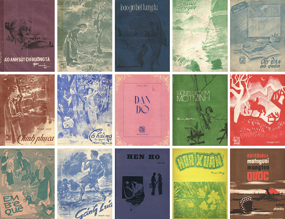
Phạm Duy Music Typography
I discovered striking covers of Phạm Duy’s songbooks on Phạm Duy’s website. The illustrations are beautiful, but I am drawn into the custom typesetting with Vietnamese diacritics. I have to create a sample page to feature the covers. Of course, I have to add some text to the page as well. I selected Eric Henry’s “Phạm Duy and Modern Vietnamese History,” which was written in English with proper diacritical marks for Vietnamese words. For reading text, I chose Be Vietnam Pro, designed by Lâm Bảo, Tony Lê, and Nguyễn Việt Anh.
Dương Thụ & Patrick X. Gallagher
Back in 2002, Mr. Patrick X. Gallagher gifted me his handmade book, which consisted of his English lyrics to 50 Vietnamese popular songs. After discovering Mr. Gallagher’s passing in 2019, I wanted to pay a tiny tribute to him. In this sample, I selected 11 songs written by the renowned lyricist Dương Thụ with translations by Mr. Gallagher. The text is set in Warbler, designed by David Jonathan Ross.
Buddhism
The philosophy of Buddhism has always intrigued me. In this example, I put together “The Fourteen Teachings of the Buddha” and “The Ten Commandments of Mindfulness” in Vietnamese and English translations, by Tâm Lạc Trần Quý Anh. The text is set in Bradley DJR, designed by David Jonathan Ross.
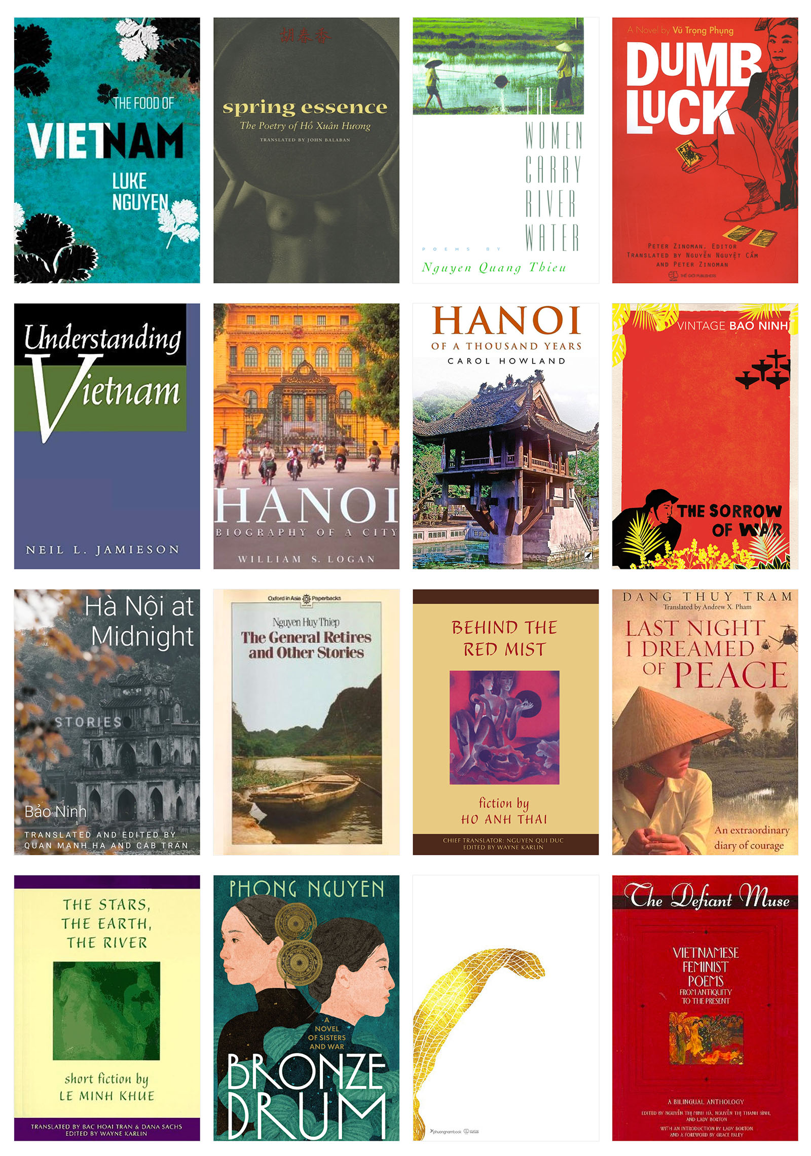
Read Your Way Through Hà Nội
To comply with New York Times style, Vietnamese diacritical marks were removed in Nguyễn Phan Quế Mai’s “Read Your Way Through Hà Nội.” In this sample, I added back diacritical marks to make Vietnamese text accessible to Vietnamese readers. The sampled article is typeset in Kaius, designed by Lisa Fischbach, and Job Clarendon, designed by David Jonathan Ross and Bethany Heck, and Change, by Alessio Leonardi. I also enhanced Nguyễn Phan Quế Mai’s Hà Nội reading list with beautiful book covers.
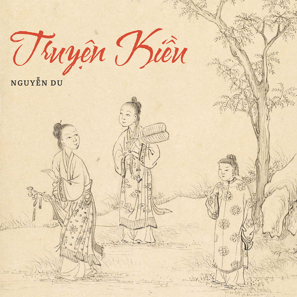
Truyện Kiều
Nguyễn Du’s Truyện Kiều is recognized as the masterpiece of Vietnamese national literature. Structured in lục-bát (six-eight) couplets, Truyện Kiều, which consists of 3,254 lines, is not only a literary Bible but also a national epic that has inspired political debate, social critique, and revolutionary spirit. To preserve this national treasure, I set the poetic tale in Portada, designed by Veronika Burian and José Scaglione. The title is set in Water Brush, designed by Robert Leuschke. The Tale of Kiều, translated by Vương Thanh, also added for English readers.
Bụi Đời (Dust Child)
Nguyễn Phan Quế Mai’s second novel, Dust Child, is sprinkled with Vietnamese proverbs. As with her debut novel, I enjoyed Ms. Nguyễn English translation of the proverbs; therefore, I marked them down as I read through the book. For this sample page, I wanted to use sticky notes to highlight the proverbs. To complement the sticky note concept, I set the proverbs in marker-style Shantell Sans, designed by Shantell Martin, Stephen Nixon, and Anya Danilova. The header and footer are set in Aneto, designed by Veronika Burian, José Scaglione, Azza Alameddine, and Roxane Gataud.
Donny Trương Presents Việtjazz
I enjoy listening to Vietnamese music and jazz; therefore, I have been curating a list of Vietnamese ballads that had been arrange with jazz flavors. Over the years, I have collected over 130 songs. For this sample, I picked out my 10 favorite Vietnamese jazz pieces. Each song gets a typographic treatment. I also paired each song with a painting from the late great Đinh Cường.

Cây Cối Quê Hương (Homeland Trees)
This poetry sample is drawn from a collection of ten poems selected among the best in the treasury of Vietnamese literature for children. These beautiful, innocent, and poetic words will light up the young readers’ souls, bring them closer to nature, and help with their language development in Vietnamese and English. For typesetting, I combined Lang, designed by Stephen Nixon, and Gimlet Sans, designed by David Jonathan Ross. I also added imagery to enhance the visual presentation.

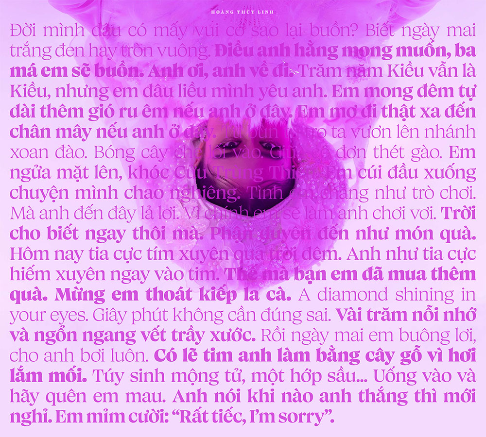
Hoàng Thùy Linh
This sample is inspired by Hoàng Thùy Linh’s fusion albums: Hoàng (2019) and Link (2022). Both albums showcase her talent for weaving Vietnamese traditional folk melody into contemporary pop production. In addition to the bouncy beats and the hypnotic hooks, the whimsical wordplays make these songs so damn addictive. For this piece, I selected my favorite lines from each track and put them together in one long running text, which set in Canicule Display, designed by Kostas Bartsokas. This sample ended up more of a typographical exploration than a readable presentation.
Liên Đoàn Hùng Vương: Scouting Songbook
My kids joined Liên Đoàn Hùng Vương, a Vietnamese Scout Pack in Northern Virginia, a few years ago. During their weekly activities, they often sang Vietnamese Scout songs from a small booklet. The kids and adults often lost these booklets; therefore, I would like to create a digital version they can access on their digital devices. For friendly reading, I chose Bree, designed by Veronika Burian and José Scaglione.
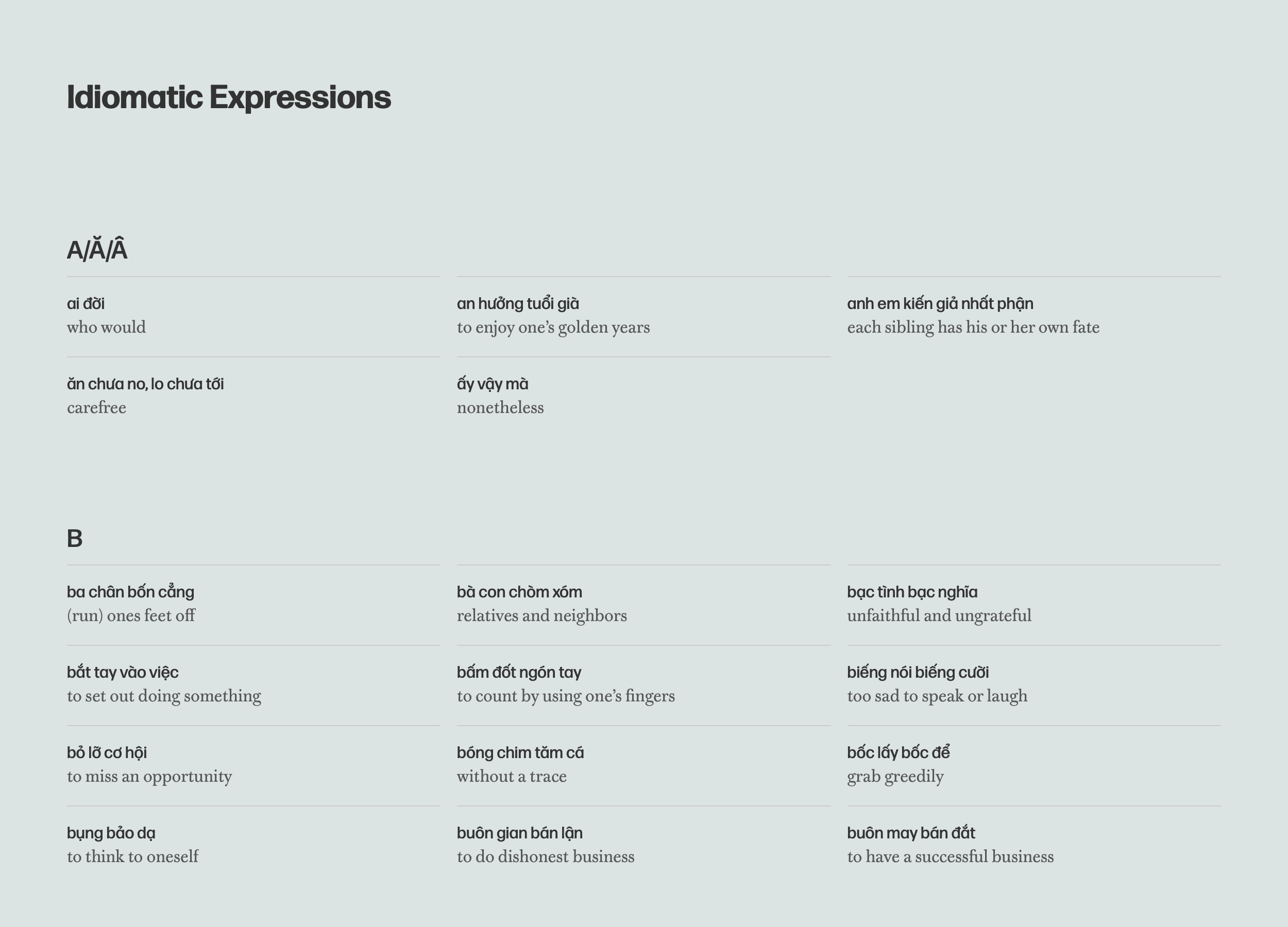
Idiomatic Expressions
An index of Vietnamese idiomatic expressions with English translations sampled from Vietnamese Stories for Language Learners compiled by Trí C. Trần and Trâm Lê. The list is fun and informative for anyone who is interested in learning Vietnamese. For typesetting, I combined Forma DJR and Warbler Text, both designed by David Jonathan Ross.
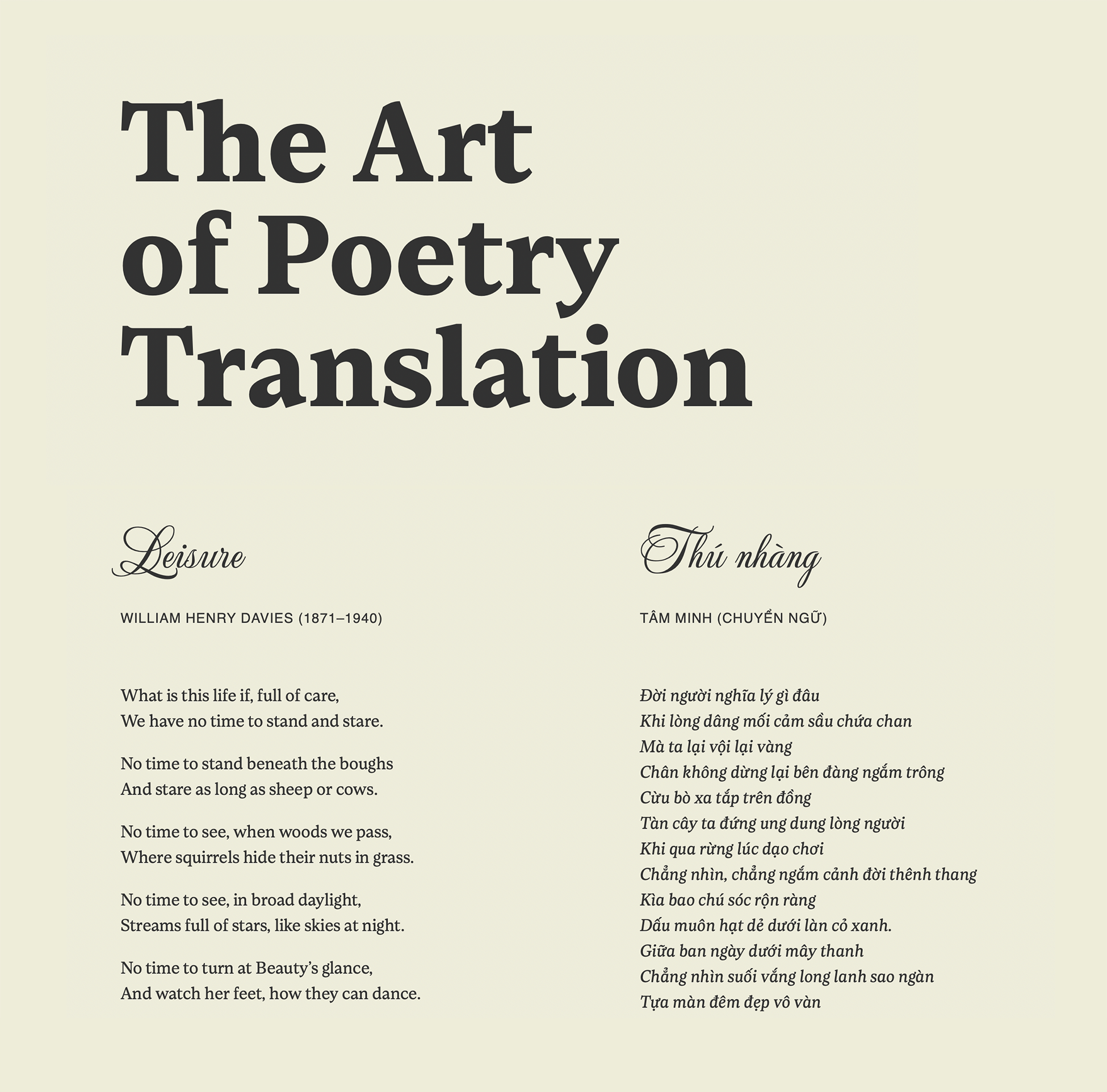
The Art of Poetry Translation
In his book of poetry collection, Spring Rain, Tâm Minh translated 50 classic works from poets including William Henry Davies, William Butler Yeats, Robert Frost, Christina Rossetti, and Thomas Hardy. I sampled a few pieces that dealt with life and death. For typesetting, I chose Loretta, designed by Abel Martins and Joana Correia, for text, Mea Culpa, designed by Robert Leuschke, for titles, and Albula Pro, designed by Silvio Meier, for authors.
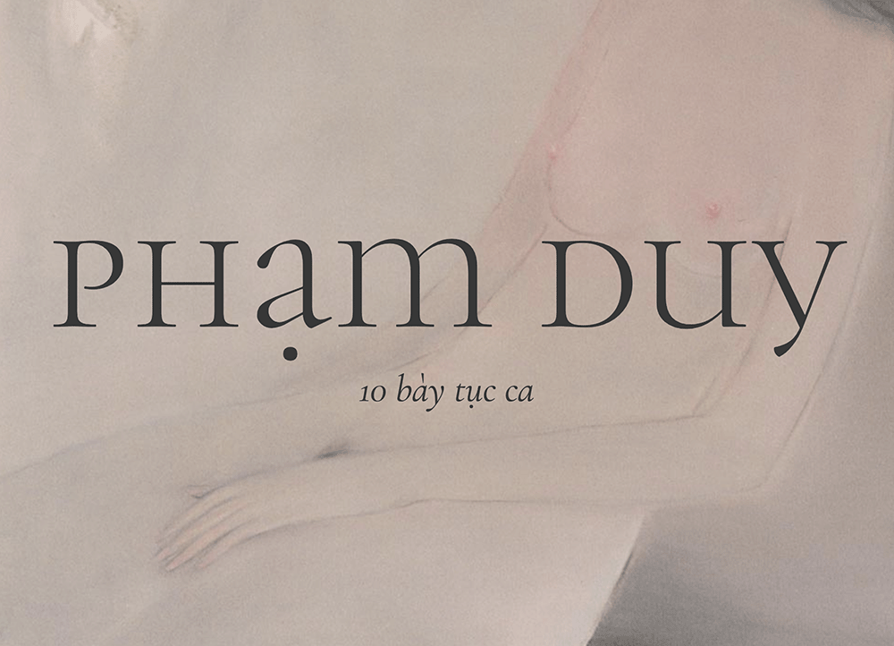
Tục Ca Phạm Duy
Phạm Duy was a renowned Vietnamese songwriter who had written many forms of music including tục ca (obscene ballads). These ten songs, which take on hypocritical attitudes and phony virtues, are so vulgar that no Vietnamese singer would dare to record them. Phạm Duy had to sing them himself. This sample is a tribute to this rare collection among his prolific works. For typesetting, I chose Cormorant, designed Christian Thalmann. I also used a nude painting, by Đinh Cường, to accompany the collection.
Sám Báo Hiếu
Sám báo hiếu is a collection of the ten sutras for filial piety. I chose Texturina, designed by Guillermo Torres, to set the words of the Buddha teaching us about our duty of respect and obedience for our parents. Texturina has the rich quality of Blackletter, which used to set religious texts centuries ago, but also maintains readability.
Tục Ngữ
While reading Nguyễn Phan Quế Mai’s beautiful, poignant The Mountain Sings, I highlighted all the tục ngữ (Vietnamese proverbs) she had incorporated throughout the novel. I love her straightforward translations of these proverbs. For this project, I pulled out all the proverbs from the book and set them in Every, designed by Anita Jürgeleit. I wanted to show the contrast between macro and micro sizes.
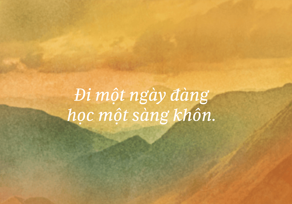
Phú Quang
Phú Quang is one of the beloved Vietnamese songwriters. His romantic ballads are melodic and lyrical. His songs about Hà Nội are nostalgic and poetic. I put together a collection of his lyrics to showcase Vietnamese typography, which set in Harriet, designed by Jackson Showalter-Cavanaugh.
Hồ Xuân Hương
Hồ Xuân Hương, the queen of Nôm poetry, was infamous for her double entendres with hidden sexual humors in her works. I put together a collection of her poems to illustrate literary typography in Vietnamese. The text is set in Fragen, designed by Lucas Descroix.
Rhymastic
Rhymastic is a young Vietnamese rapper with virtuosic flows and lyrical skills. He piqued my interested in Vietnamese hip-hop. I put together this page to showcase his storytelling as well as to provide a sample of editorial design. The text is set in Frequenz and the heading is set in Sequenz, both typefaces designed by Sebastian Losch. Although Maelstrom Sans, designed by Kris Sowersby, does not support Vietnamese, I included it to spice up the design.
A Useful Guide for Diacritics
In Vietnamese writing, the hook above and the tilde are often misspelled because they often sound the same in speech, especially for the South Vietnamese. In most cases, I have to consult a dictionary to make sure I get the right mark for the word I intended to communicate. When I came across this guide, which helps to differentiate between the two, I wanted to include in this section. It might be useful for type designers to copy and paste the text to see how their Vietnamese characters look and feel. The text is set in Exchange, designed by Tobias Frere-Jones, and the headings are set in Halyard, designed by Joshua Darden.
Trịnh Công Sơn
As huge fan of Trịnh Công Sơn’s music, I have always wanted to collect all of his songs and to showcase his philosophical quotes on love, life, and death. I went through 244 songs, picked out 158 I love, and put them together on one page. Taking advantage of variable font technology, Roslindale, designed by David Jonathan Ross, is set in text, titles, and highlights from one font file.
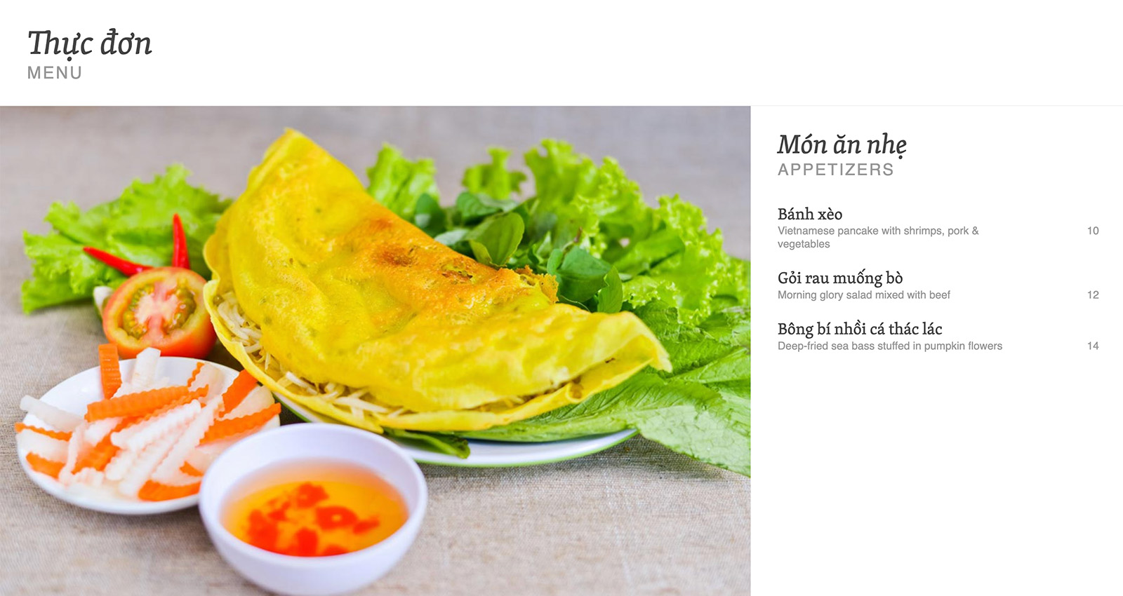
Vietnamese Menu
Unlike Vietnamese food, good Vietnamese typography on restaurant menus is hard to find. In this sample, I combined Skolar and Skolar Sans, designed by David Březina, to create a simple, elegant Vietnamese-English menu with striking photography will make you drool.
Thơ Mưa
Poetry is essential to Vietnamese culture. The people (from academia to illiterate) are poetic by nature. To demonstrate Vietnamese typesetting in the literary context, allow me to introduce Cao Nguyên’s Thơ Mưa, a web-based poetry book I had designed. The typefaces are Alegreya and Alegreya Sans, designed by Juan Pablo del Peral.
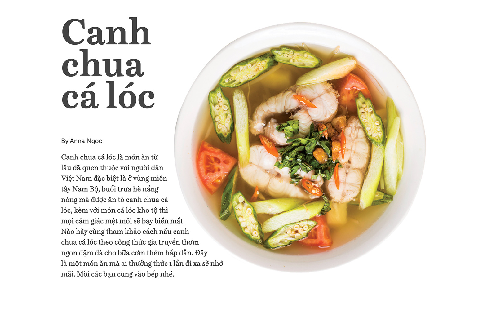
Vietnamese Recipe
Food plays an important role in the Vietnamese culture and Vietnamese people love to cook. To show off Vietnamese typesetting with Vietnamese food, I designed a recipe for one of my favorite Vietnamese soups: canh chua cá lóc (sour soup with snakehead fish). Typeset in Schotis, designed by Juanjo López, and Amica Pro, designed by Dave Rowland.
A Legend of Ancient Vietnam
The birth of the Vietnamese people is a fascinating mystical legend. According to the mythical story, the first 100 children of Vietnam were the sons of the Dragon King Lạc Long Quân and the Fairy Princess Âu Cơ. Despite their love, the couple had their differences. As a result, Lạc Long Quân took 50 of their sons to the water and Âu Cơ took the other 50 to the land. Even today Vietnamese people are proud to refer to themselves as the descendants of the dragon and the fairy (con rồng cháu tiên). To demonstrate readability in Vietnamese literary, I set the text in Pliego, designed by Juanjo López.
